Judging a Book by Its Cover: Oxford Blues Cover Reveal
Today marks the cover reveal of Andy Griffee’s latest book in his Johnson and Wilde mystery series, Oxford Blues, so we thought that we’d share a few words about the cover design process.
Cover design is crucial to a book’s success – it’s the very first thing you see as a potential reader, before you’ve even had a chance to hear anything about the story that will eventually reel you in, and the visual language of the design tells us at a glance what genre the book is, what to expect. In one image, the cover tries to convey an entire story, giving a window into what might unfold.
The cover needs to work both as a beautiful dustjacket book browsers will pick up in shops and as a tiny thumbnail that stands out for online retailers. So, although people say don’t judge a book by its cover, it’s also almost impossible not to. No pressure, then!
In one image, the cover tries to convey an entire story, giving a window into what might unfold.
The process starts with a brief of the book and researching similar books of that genre. In a series, like Andy Griffee’s Johnson & Wilde ‘canal noir’ crime, you also need to follow the style of previous books without becoming generic.
Next, it’s time to create the visuals. With Oxford Blues, this meant looking for different images that we wanted to use. This meant searching through hundreds of photos, finding ones that were just right to give a nod to the story and its specific details – but without giving any spoilers.
Of course, then it’s important to have cover meetings. The editor plays a very important role when it comes to the realisation of the cover, but sales & marketing and design are key too. There are always multiple routes and ideas being worked up at this point – and a lot of choices. Then, after the design has been approved in several cover meetings, it will be sent to the author.
During all of this process, the design team also works closely with the Production team, who are responsible for creating the physical book or dustjacket. At Orphans, we’ve got our very own printing press, which means we do it all in-house and can see the concept fully through to completion which is very exciting!
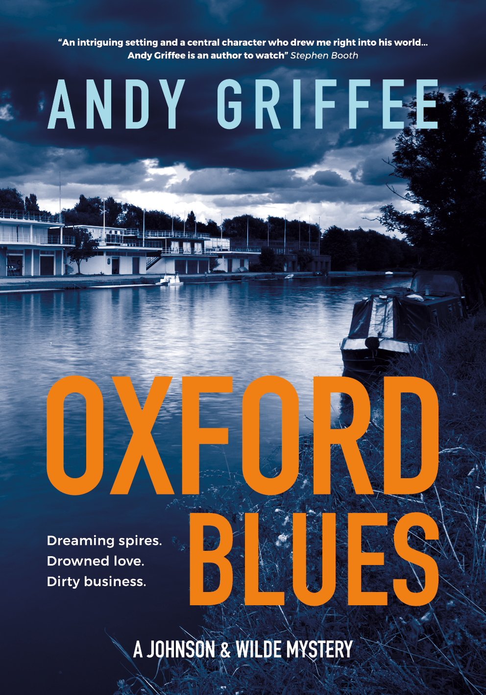
Here’s a small insight into this decision-making process with Oxford Blues…
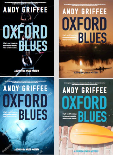
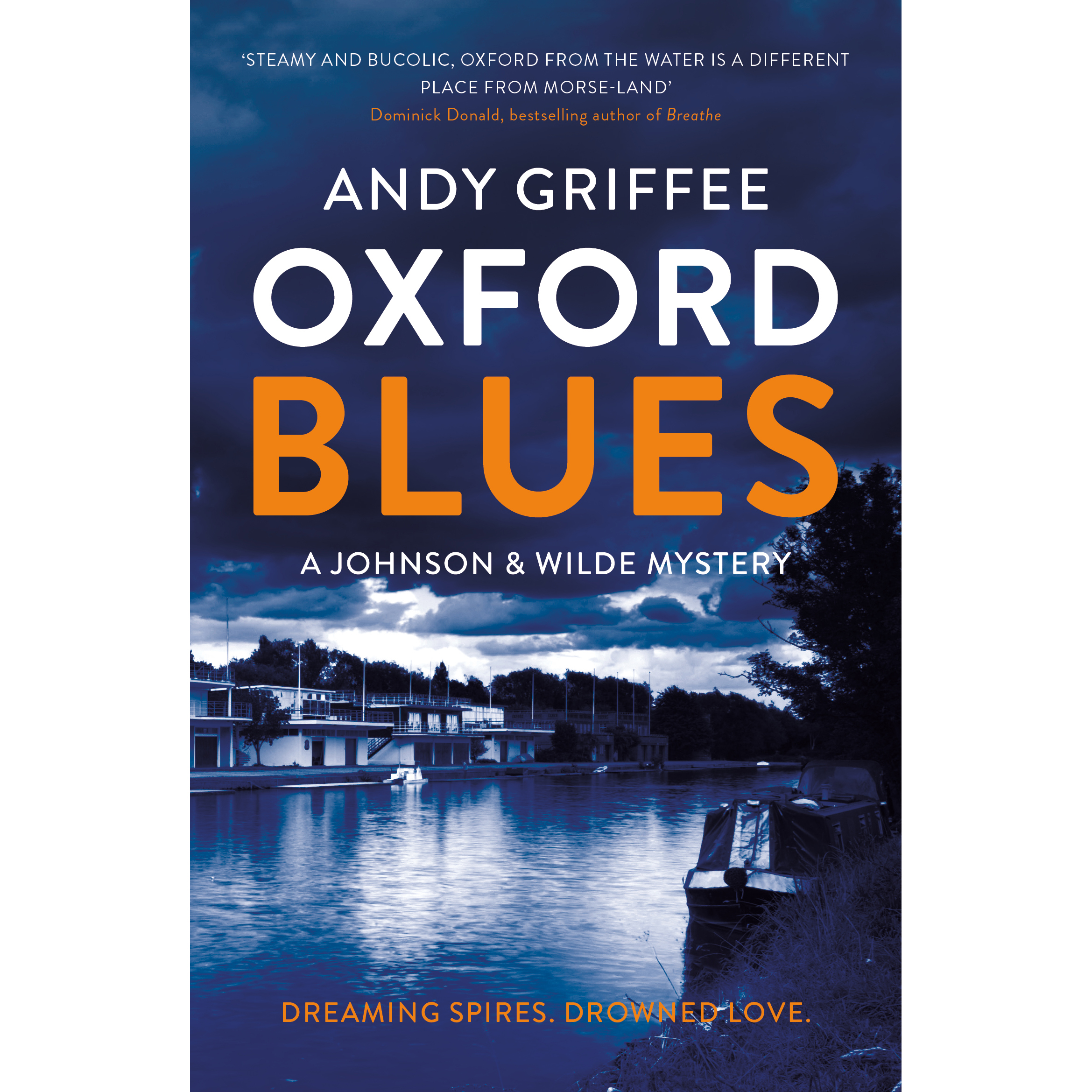
We started by looking at a range of different water-based photos from image library photographs (the rowers make reference to the deep ties that rowing has in Oxford). We tried out a variety of different images, from abstract images of an oar bisecting the water to more literal interpretations of the storyline…of course, we won’t want to give too much away!
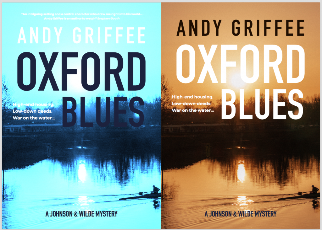
We tried out different versions of the same image with different colour combinations and grayscale. We liked the combinations of the blue and orange, giving a nod to the famous Cambridge-Oxford boat race. However, we didn’t feel that any of the original choices stood out enough as a thumbnail image and we also needed a cover that worked alongside the Canal Pushers and River Rats covers.
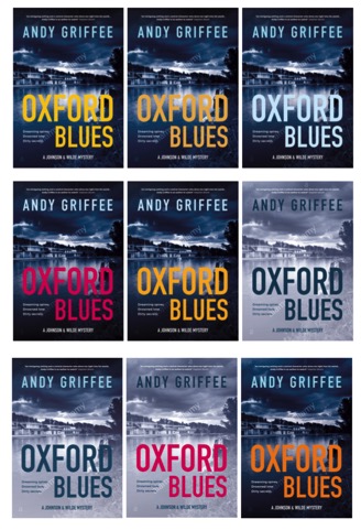
We finally decided on the photo that you can now see on the cover! In our minds, it was perfect to demonstrate the ominous nature of the canal-noir genre and looked good alongside the other books in the series. The boathouse gives a nod to the rowing, while not ignoring the canal boat crime on the water! The dark orange colour of the title we felt was the most powerful and stood out from the other colour combinations that we tried.
So, there you have it! A very condensed look into the decisions behind the cover of the Oxford Blues. Now, we can’t wait for you all to read it!
Featured Publications
Oxford Blues
Book 3 in the Johnson & Wilde crime mystery series and Jack and Nina are in Oxford – but what lies beneath Iffley Lock? “An intriguing setting and a central character who drew me right into his world” -Stephen Booth Winter onboard a narrowboat can be a cold and lonely affair and Jack Johnson is keen to catch up with Nina Wilde, who has moved to Oxford to be near her niece, Anna, an undergraduate at the university, […]
Read More